Why Bar Charts Are My Favorite
Communicating is an integral part of data science. No matter how valuable the insights are, they are of no value if the business does not understand them or you have to work really hard to explain them.
Data professionals are often tempted to use complex and advanced data visualization in their storytelling. I personally have been a victim of this temptation. However, over time I have learned that the simple and familiar tools of communication are always the best. Your recipient does not need to put extra mental effort to read the message. In that spirit, bar charts are very instrumental to communicate the results of data-driven investigation.
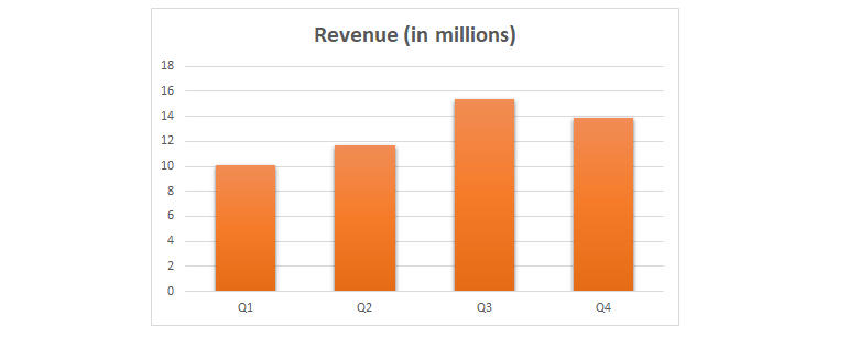
There are quite a few different variations of bar charts. The simplest bar chart consists of a single data series, for instance, the quarterly revenue of a company.
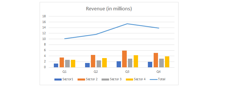
We use grouped or clustered bar charts to represent data of multiple series.
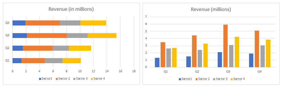
Sometimes we transform a grouped bar chart into a stacked bar chart for comparison of the share of each sub-group. If the main categories have longer names, it is a good idea to use horizontal bar charts rather than vertical ones.
Bar charts also allow us to add the 3rd dimension as a second y-axis. But this is something not highly recommended as it impacts the readability of the chart. We can rather a line chart on top of vertical bars.